

![]()
NEED PRINTING? click here! fast, easy, affordable
a guide to printing & file types
The following information is intended and a basic overview of the printing process and a brief description about each type of file listed. This is not an absolute guide. If you have any specific concerns, please be sure to talk to your printer about them, as different equipment and its usage could result in varied outcomes.
file resolution • printing • fonts
|
|
|
|
|
|
|
|
|
pdf
|
jpg
|
EPS
|
Photoshop
|
tif
|
Quark
|
gif
|
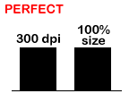
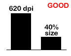
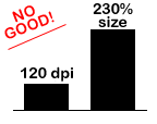
In the chart above, A represents an ideal set up. The image used has a resolution of 300 dpi and it is being used at 100% size. In B, that same image has been decreased in size. The direct resolution-to-size relationship pushes the resolution up to 620 dpi. It is not necessary to have a file over 300 dpi, but it doesn't hurt. In situation C is where the problem resides. Once that same image's size is increased over 100%, it begins to drop in resolution, thus becoming more and more blurry. Although it may appear clear on a computer monitor or even from a small office printer, once it is on the printing press it will be very blurry. This is why it is not always an option to increase the size of a given photograph or graphic element. NOTE: Just about every image on the internet, graphic and photographic, is a low-res jpg or a gif, which are both unuseable for print work. [ top of this page ] |
|||||
|
There are two different kinds of color systems. Four Color Process and Spot Color. Four Color Process is four colors of ink dotted onto the paper to create all the necessary colors on the piece that is being printed. The colors used are cyan (C) •, magenta (M) •, yellow (Y) • and black (K) •. This type of printing, known as "process" or "CMYK", is the most common as it is the least expensive. One drawback to printing CMYK is that there are some colors that cannot be achieved. For these colors (such as bright oranges, blues and any metallic colors) you must use a spot color. Spot colors are used primarily when a color must be exactly the same all the time (such as when printing a company logo) or when a desired color cannot be obtained with a four color process. All spot colors are assigned numbers by the manufacturer. Pantone® Inc has created The Pantone Matching System® (PMS) which, for example, is where colors like PMS 187 get their names. There are other manufacturers of colors, such as Toyo Ink, however the most widely used colors are in The Pantone Matching System®; it is the industry standard. These two printing processes can be combined to create what is usually referred to as a "five-color-job" or "six-color-job". In this case, the four color process is used for most of the printing but there are areas where PMS color(s) are added to the job. Vast combinations and variations of these two processes can be set up. There are several options on how to achieve the desired shine on a printed piece. Different types of paper produce different results. Matte paper will not shine much versus coated paper, which will. Papers can be coated on one or two sides. This is where you get the term C1S or C2S (Coated One Side / Coated Two Side). Keep in mind that writing on a coated stock is difficult, so items such as postcards are generally printed on C1S, so that you can write on the mailing side, but the photo side still has a nice shine. You would not want to have anything that people need to write on printed on a coated stock. In addition to the paper, there are processes that the printer can go through to add shine and luster. 1) Spot Varnish. This is a varnish that is layed down on certain parts of the piece to help make things jump out. It is considered a spot color when printing. 2) Aqueous Coating. This is an overall coating that is usually done to make the piece have a shine. It's not considered a color, rather as a finish. Most printers will do this at no additional charge. 3) UV Coating. This makes an extreme shine. This is a very special process that cannot be done by the printer. Your piece will need to be printed, then shipped to a UV house for this treatment. The results are undeniably outstanding, but the process can be quite costly. [ top of this page ] |
|||||
|
TYPES
OF FILES: |
|||||
|
This very common file is mainly used to make printable text forms. As far as in a graphic arts arena, a pdf file is great for proofing text and positioning. However, when viewing the pdf of a design layout it is not uncommon for fonts to not load correctly, for there to be spacing issues or for images to appear low quality, all of which may not be a problem in your actual design file. In some rare cases, graphic elements from a pdf file can be extracted and used, but usually a pdf is too low resolution to use for print work. [ top of this page ] |
|||||
|
Another very common file. A jpg is a highly compressed image file. A jpg is a file that has the capability while compressed, to hold the information to create millions of colors when uncompressed. They can be created as "high-res" or "low-res" jpg files. High-res jpg files can be uncompressed to be significantly larger than their compressed size. Low-res jpg files, the more common jpg, cannot be expanded to much larger than it's original size (100%). Because jpg's have such a good compression, they are widely used to display photos for screen applications (internet use). Usually these files are no more than 72 dpi, which is far too low for printing. When these 72 dpi jpg's are brought up to 300 dpi, they are usually far too small to use. NOTE: while a jpg can hold the color information for a CMYK file, most jpgs are RGB and will need to be converted to CMYK before going to press. Conversly, a jpg left in CMYK mode will not display on screen. [ top of this page ] |
|||||
|
This is a special type of file. It can be created and opened in many types of programs (Adobe Illustrator®, Adobe Photoshop®, Quark Xpress® and more). What makes an EPS special is that is has the capability to contain vectored art. Vectored art means that it does not contain a resolution. It can be shrunk and/or expanded to any size without having to worry about it becoming blurry. That doesn't mean that all EPS files are or can be vectored! Only line art can be vectored art and it must be CREATED as vectored art. You cannot vector a photograph, any other types of images or an existing non-vectored line art. Only line art, logos and things of that nature can be vectored and only when they are originally created. [ top of this page ] |
|||||
|
This file can only be opened in Adobe Photoshop®. This is a popular program to create backgrounds and complicated graphics. The most noteable feature of a Photoshop® file is that it supports layers. A layered file is essential when attempting to re-arrange art that has been created by someone else (like when using one package's art to create another package). With a layered file, you can move parts of an file around to fit your needs. However, a Photoshop® file is not always useable. It is possible to flatten a Photoshop® file, which makes it impossible to move the graphic elements. [ top of this page ] |
|||||
|
A tif is an image file that does not allow compression. This type of file is the preferred format when designing and when going to print. This file accurately supports CMYK (unlike a jpg, which is RGB or a gif, which the color is indexed). Just like any other image file, a tif's resolution is variable. So for printing, following the same seesaw rule as stated above, a tif should be 300 dpi at 100% size. It is possible to create low-res tifs, which would be just as unuseable as any other low-res image file. [ top of this page ] |
|||||
|
Quark XPress is a layout program. It allows the designer to put graphic elements and typed text together and easily manipulate their position, size, etc. However, a Quark file is only a container that displays the fonts and images in the manner that you tell it. For example, when you insert an image, it does not embed the image into itself (like in Word), it only creates a window for the image to be displayed in and links it to the Quark file. Therefore, you must have that image when passing this Quark file along to someone else or for printing. The same rule applies for the fonts. After typing in text, Quark looks for the font file so that it knows how to display the text you just typed in. A common mistake is to build a layout in Quark and then simply give that file to someone else. You must "collect for output", which means gathering all of the fonts and images used in that Quark file, preferrably placing them in folders labelled "fonts" and a folder labelled "images". [ top of this page ] |
|||||
|
A gif is an image file. It is an extremely condensed file that contains very limited colors. A gif contains anywhere from two to 256 colors. These are the 256 "web-safe" colors. Unlike a jpg, which contains millions of colors and compression information, a gif cannot be expanded or converted to anything useable for print work. A gif file is primarily used to display on screen (as on a website), since it supports a transparent background and animation. [ top of this page ] |
|||||
|
Fonts are bitmapped files that create differently shaped letters and numbers. Some fonts are common and some fonts are not. When designing a piece, usually several fonts are used. When transferring your layout file, no matter what program it is in, you must also send along the fonts used in that piece. The reason is that if the next person does not have that particular font, the job cannot be printed correctly, it will have "missing font(s)". It is possible to replace missing fonts with others that are similar in appearance, but the new designer would need to see what the font looks like to get a close match. In this case a print from the original designer would be needed. When transferring the layout file, even the most common fonts, like Arial, Helvetica, etc., should be included. The reason for this is that one person's Helvetica may be slightly different than another person's Helvetica, which could cause shifting in position of text or images. Damaged fonts are treated the same way as missing fonts. Font files are small and easily damaged when being transfered. Going from one person's machine to a disk, then to another machine, then maybe to a server, then back to a disk... well you get the picture. There is also the issue of MAC fonts and PC fonts. While there are a lot of fonts with the same names for both platforms, fonts from a MAC cannot be used on a PC and fonts from a PC cannot be used on a MAC. They are two completely different types of files. [ top of this page ] |